(Followed by Japanese; 日本語版は英語版の後に続きます)
ごきげんよう!
生まれ持った才能を心と体から引き出す
エンターティナー
彩加【Ayaka】です。
こちらの記事は2投稿目の英語の記事になります。
今日のトピックは「彩加ロゴのお話」です。
✅このロゴの意味は?
✅なんでクレヨンがロゴに選ばれたのか?
こちらの記事は、私の過去の記事の改訂版となります。
日本語の元の記事はこちら
今回は特に「くれよんさん」に焦点を当ててお話しします。
ぜひお楽しみください!
注:元記事は1回の投稿でお届けしたものですが、
加筆をして、今回の記事を3回に分けて再度お届けします。
英語でも自身の考えを届けたい、そして
日本語の読者の皆様にも触れていただく機会も作りたい
という想いを込めて。
****************
【ロゴの形と「くれよんさん」】
このロゴは、キッズや大人たち、そして
障がいのある仲間たちからも愛されています。
このロゴは、地球の形をしており、
子供用のクレヨンでできています。
クレヨンは使われるうちに形が変わっていきます。
それはまるで、一人の子供が
身体的・精神的に成長する姿のように見えます。
「留学し、ダンス活動をしてきた英国での経験を、
今生きている世界へと繋げる。」
このロゴには、そんな思いを込めました。
ロゴのクレヨンの形は、
私のコンセプトワードの一つである
「くれよんさん」から生まれました。
(”-さん” は、
日本語で男女問わず使われる敬称です。)
「くれよんさん」の由来となったのは、
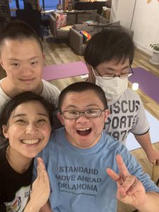
私の大切な障がい施設の仲間たちです。
彼らは日中「Cafe くれよん」で働き、
毎月のヨガクラスを楽しみにしてくれています。
色の違いは個性となり、
個性は才能へとつながっていきます。
これは、老若男女すべての人に当てはまることだと思います。
障がいの有無に関わらず、誰にでも当てはまることです。
だからこそ、
私はどんな方でも「くれよんさん」と呼びたいのです。
才能は誰にだって、あるものですから。
彼らとの奇跡のダンスコラボ?!
その才能を温かい心で見届けてください✨
*********************************
今回は、このロゴの由来と
「くれよんさん」へのメッセージについて
お伝えしました。
次回の記事では、
障がいのある子供たちを理解しようとしている
保護者の視点をご紹介します。
読んでくださり、ありがとうございました!
ごきげんよう!
彩加でした♪
:::::::::::::::::::::::::::::::::::::::
【Ayaka logo story part1: Birth】
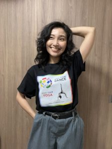
Hello!
I’m Ayaka, a Japanese entertainer, shining a light on the natural talents within you— both mind and body!
This will be my second article in English. My first English article is a greeting post to celebrate the launch of this website.
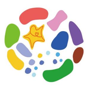
Today’s topic is: the story behind Ayaka’s logo.
![]()
✅What does this logo represent?
✅Why are crayons chosen for the logo?
This article is a revised version of one of my past posts. If you’re interested,
→here’s the original article in Japanese
This time will focus on the story with ‘Crayon-San.’
Please enjoy!
Note: While the original Japanese article was published as a single post, I decided to update the original one, and divide the English version into three parts.
I want to share my thoughts in English while also providing opportunities for Japanese readers to engage with the content.
*********************************
【The Shape and “Crayon-san”】
This logo is loved by children, adults, and my friends with special needs. The circular shape represents the Earth, and it is made up of crayons—just like the ones children use. As kids use their crayons, the shapes naturally change. This transformation resembles how a child grows, both physically and emotionally.
I designed this logo to connect my current life with my past experiences in the UK,
where I studied and worked as a dancer.
Each crayon in the logo is inspired by my concept of “Crayon-san.” (”-san” is a Japanese honorific use for both men and women.) The name “Crayon-san” was inspired by my dear friends at a special needs facility. They work at Café Crayon during the day and always look forward to our monthly yoga sessions.
Each crayon color represents a unique personality. That individuality, in turn, becomes a talent. I believe this applies to everyone— regardless of age, gender, or disability.
That’s why I want to call EVERYONE “Crayon-san.” Anyone already have the talent!
And as for our magical dance collaboration…?
I invite you to witness their incredible talents with an open heart! ✨
→Click here for our dance collaboration show! (ダンスコラボはこちら)
****************************
This time, I shared the story behind my logo— its origins and my goals and message to ‘Crayon-san’.
In my next article, I’ll share the voices of parents, trying to understand children with special needs.
Thank you so much for reading!
Gokigenyo!
From Ayaka